Heat
Landsat C2 L2 Surface Temperature, 30 m
The base layer: surface temperature from a cloud-free summer scene. For cities with persistent cloud cover, a median composite of several summer scenes.
A public map of urban heat islands across Russia: land surface temperature at thirty-metre resolution, computed entirely from open satellite data — with no closed source anywhere in the chain, no model trained on private data, and no server that can go down.
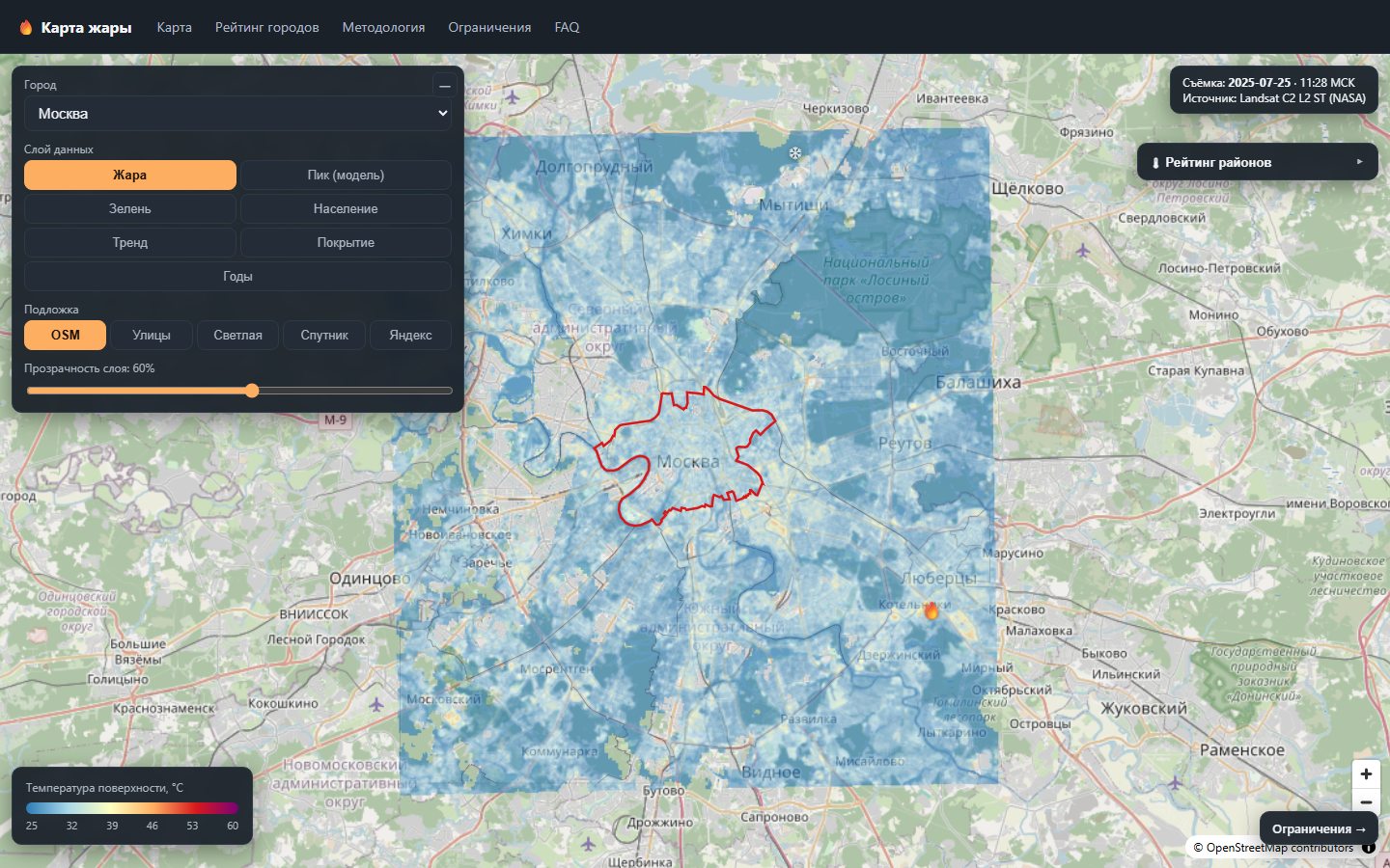
The urban heat island is neither a metaphor nor a turn of phrase. It is a measurable physical effect: dense construction, dark roofs and sealed ground absorb solar radiation during the day and release it at night, while the evaporation from vegetation that cools open landscapes is all but absent in the city. The result is a persistent temperature difference between neighbourhoods of one and the same city — in our measurements, up to thirteen degrees.
The instrument of observation, meanwhile, is out of scale with its subject. An urban weather network offers one or two points for a city of a million, and a bulletin reading «Volgograd, +36» describes the whole city with a single number — even though the Krasnoarmeysky district and the reservoir shore are two different climates. Someone choosing where to live, a physician assessing heat-stroke risk and a planner deciding where to plant trees all work from a picture with no spatial resolution at all.
A satellite provides exactly what the weather network cannot: a regular thirty-metre grid across the entire city, a decade of retrospective data, and one identical method for Makhachkala and for Moscow. The institute framed the question as an engineering one: without a satellite of our own, without closed data and without a budget for permanently running infrastructure, can we build a tool that tells a city administration, a physician, a journalist and a resident the same thing — where in this city it is hot, by how much, and why.
Heat Map is our answer. The working formula is short: open data, open models, monitoring of fact instead of forecast, and a cheap static map. And one principle that sets the tone — the physics is to blame, not the people. The map does not accuse the city; it shows where physics works against the resident, and what exactly can be changed.
The project measures LST — land surface temperature, the temperature of the ground cover itself: asphalt, roofing, tree canopy, water. This is not what a thermometer on a balcony shows, and the difference between the two is not a correction factor but a physically different quantity. At midday a surface can be twenty degrees hotter than the air above it; at night, colder.
We deliberately refuse to «convert» one into the other for the reader's convenience. The quantity we can stand behind is the measured one; the quantity we would have to model would look better in a headline and worse in science. So the map repeats this caveat in the interface, in the layer captions and in every export — and modelled quantities, such as the daily peak, are labelled as estimates.
The practical meaning is not lost by this, only shifted. Surface temperature describes directly how the urban fabric handles solar energy: where a roof acts as a heater, where a courtyard has no shade, where a patch of greenery pulls a whole block down. That, rather than the reading of one screen shelter in a park, is what answers the question of what to do.
Every city travels the same path from a query to the satellite catalogue to a published layer. The steps are idempotent: a repeat run does not spoil the result, and recomputation is requested by an explicit flag. Model versions and checksums are pinned in configuration, the logic is covered by unit tests, and each city's state is machine-readable — so the pipeline can be stopped and resumed at any step.
Scene search and selection through the STAC catalogue of Microsoft Planetary Computer: Landsat Collection 2 Level-2, Sentinel-2 L2A, ESA WorldCover. Signed links are read as streams, without downloading whole archives. District boundaries come from OpenStreetMap via Overpass — with several mirrors, retries and a disk cache, because open infrastructure is occasionally unavailable.
Scenes are brought onto a common grid and the surface temperature field is computed. For cloudy cities we use a median composite of summer scenes, which tolerates gaps. A separate pass produces the modelled estimate of the daily peak.
Zonal statistics over real administrative boundaries: median, mean, sealed-surface fraction, population density and a final exposure index for every district. The index combines temperature (weight 0.5), population (0.3) and greenery deficit (0.2) — weights fixed in configuration, not tuned to produce a pleasing picture.
Each layer is published in two forms: PMTiles for rendering and a PNG value grid for client-side computation. One file per layer, plain HTTP with byte ranges — no tile server, no database, no single point of failure.
A publication gate, not a report written after the fact. A city does not enter a release until it passes the check: the method permits publication at a root-mean-square error of no more than 2.5 K, and scenes with insufficient coverage are rejected automatically.
The heat layer answers the question of where it is hot. The other six answer why, and whom it concerns — and it is their intersection that turns a handsome picture into an argument.
The base layer: surface temperature from a cloud-free summer scene. For cities with persistent cloud cover, a median composite of several summer scenes.
The satellite images the city at around 11 a.m. local time. This layer extends the diurnal cycle to the daytime maximum — a computation rather than a measurement, and labelled as such.
The vegetation index. It matters not in itself but as the way to tie heat to the absence of vegetation and to test that link quantitatively.
Population density. It turns the question «where is it hot» into the question «how many people live where it is hot».
The rate of change of surface temperature, °C per year. The slope is computed in the browser itself from annual value grids, with a two-handle slider for the start and end year.
Land cover classes: the sealed-surface fraction and the built-up versus vegetation contrast — that is, the measured strength of the heat island (SUHI).
A slider over the years: temperature, median, and departure from the first year of observation. Eleven slices for each of the ten cities — 110 layers in their own right.
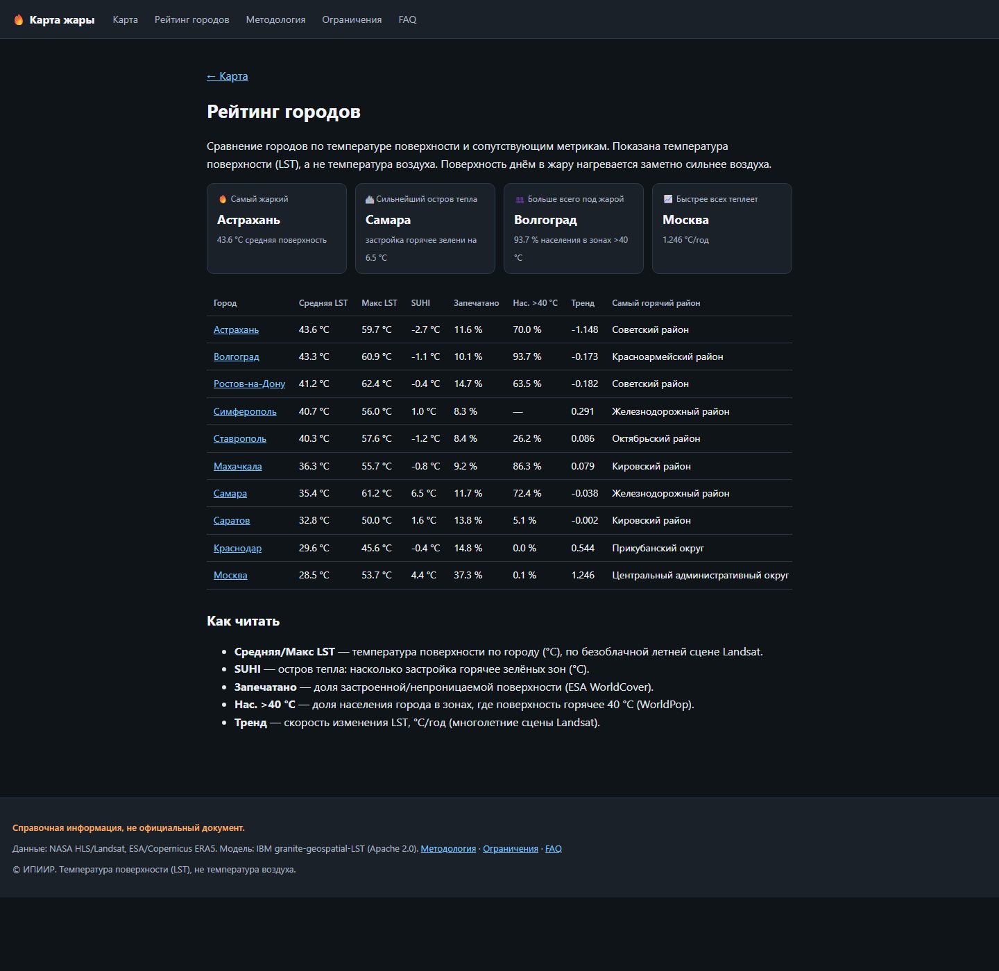
Every figure below comes from real satellite scenes rather than demonstration data, and is reproduced by the pipeline from source. They describe specific acquisition dates — this is monitoring of fact, not a climate forecast.
The highest mean surface temperature among the ten cities. Not «hot in the shade» — hot underfoot, across the whole city.
The peak surface temperature in frame. Values like this come not from residential blocks but from industrial zones, roofs and bare asphalt.
The share of the city's population living in zones where the surface exceeds 40 °C. At this point it stops being a temperature map and becomes a map of the load on people.
The rate of increase in the city-median surface temperature over 2015–2025. The fastest trend in the sample.
Heat island strength: how much hotter built-up areas are than green ones at the same moment of acquisition.
The difference between sparsely green and green neighbourhoods. The link between greenery and heat is negative almost everywhere: from r = −0.33 in Saratov to r = −0.76 in Simferopol.
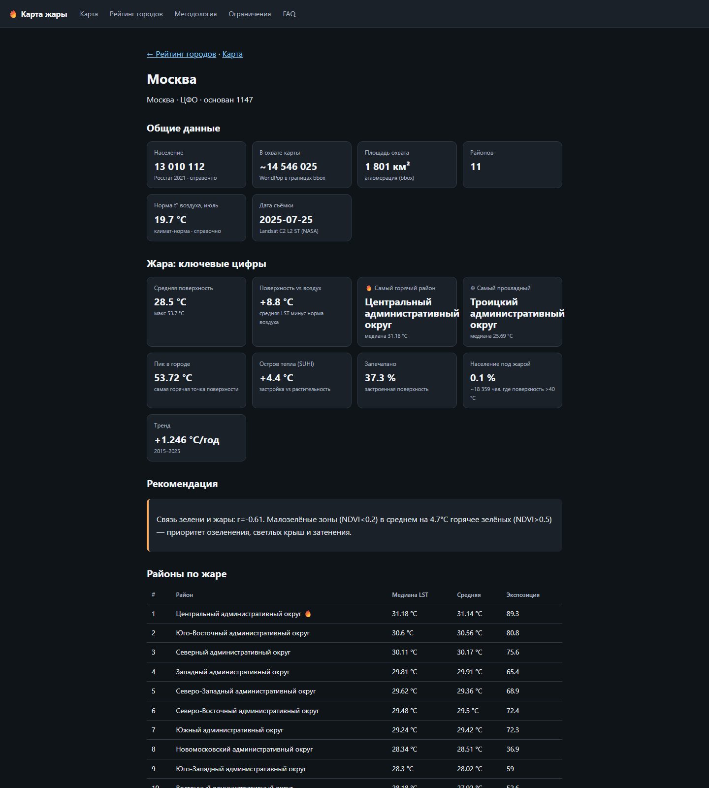
Every city has a page of its own: general data, the key heat figures, the gap between surface temperature and the climatic norm for air, a district ranking by exposure, and a stated recommendation. It is something you can attach to a letter to the city administration without having to retell the map in words.
A limitations section is mandatory for this project under our internal rules, and it opens from the same navigation as the map itself. A tool that does not list its own weaknesses is not a scientific tool.
A public tool lives exactly as long as somebody pays for its infrastructure. Heat Map is therefore built deliberately to have no moving parts: the pipeline's output is a set of static files, and the map in the browser reads them directly over ordinary HTTP range requests. No database, no tile server, no background process, no access keys on the client. The cost of keeping such a map alive tends towards the cost of serving files, and its resilience equals the resilience of static hosting.
The computations that do need to be interactive were moved into the browser: the per-pixel trend for an arbitrary period is calculated on the client from annual value grids while the user drags the slider. This is the rare case where pushing computation onto the user is not a saving but an architectural decision — a server would have nothing to compute faster.
Reproducibility is delivered by the shape of the pipeline rather than by a declaration: model versions and checksums are pinned, steps are idempotent, each city's state is machine-readable, the pure logic is covered by tests, and scenes and intermediate products are cached to disk so that a repeat run does not depend on external services being up. Any step reproduces with one command from source — including a full run on synthetic data, if the reviewer has no access to satellite catalogues.
The institute's contribution is neither the data nor the model architecture but what lies between them: adapting the model, engineering the pipeline, making validation a condition of publication, zonal analytics over real administrative boundaries, and a product usable without special training. We think it right to say so plainly: what is borrowed is named as borrowed, what is ours as ours.
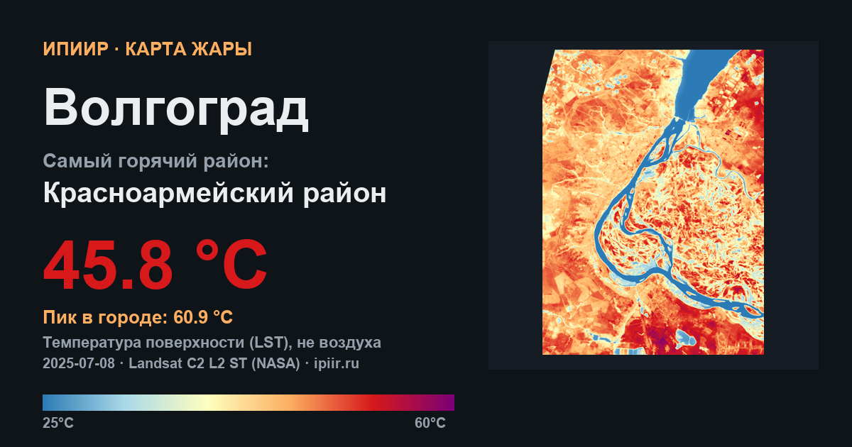
Ten cities are currently published on real satellite data: Moscow, Rostov-on-Don, Volgograd, Astrakhan, Samara, Saratov, Krasnodar, Stavropol, Makhachkala and Simferopol. The sample leans south on purpose: there heat is an annual norm rather than an anomaly, and the cost of a planning mistake is higher. Each city has all seven layers, real administrative boundaries, a district ranking, an eleven-year annual record and a shareable card. The pipeline runs end to end and the interface builds into a static export.
Immediate tasks: publication at a permanent address on the institute's domain and a load test of tile delivery; refining the trend to the median of per-pixel slopes; a common valid-pixel mask for annual medians, to remove the noise of comparing composites with different coverage; narrowing the vegetation class in the heat island computation so that dry summer cropland stops masking the effect of built-up ground; and checking reference regional indicators against primary sources. After that, more cities.